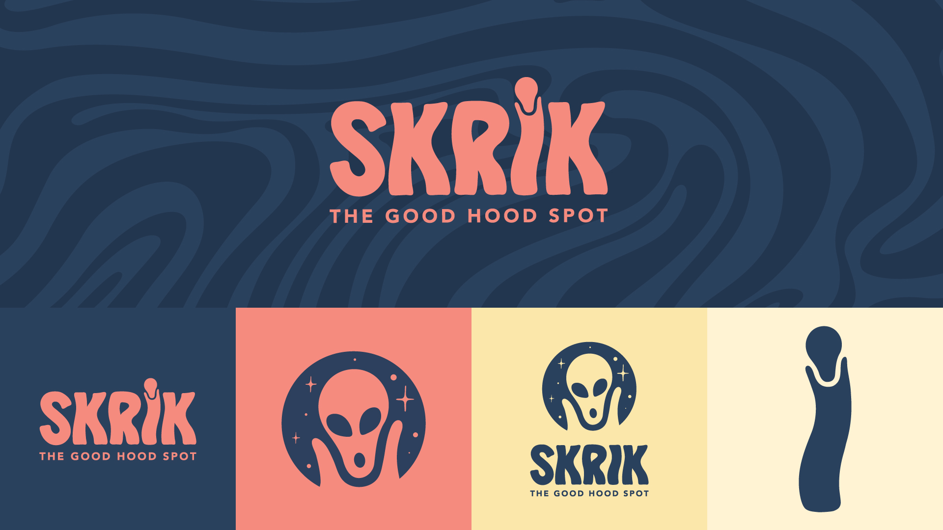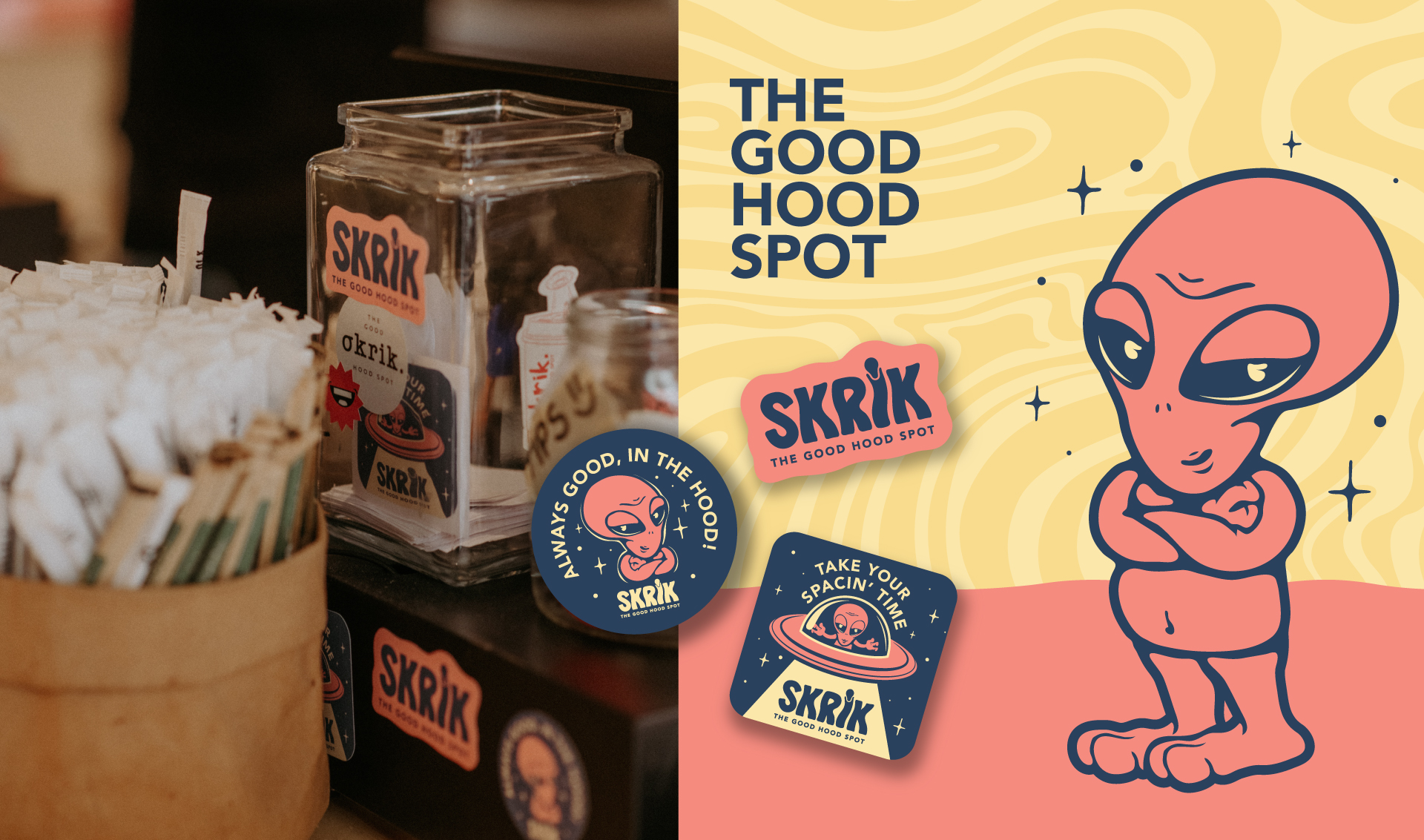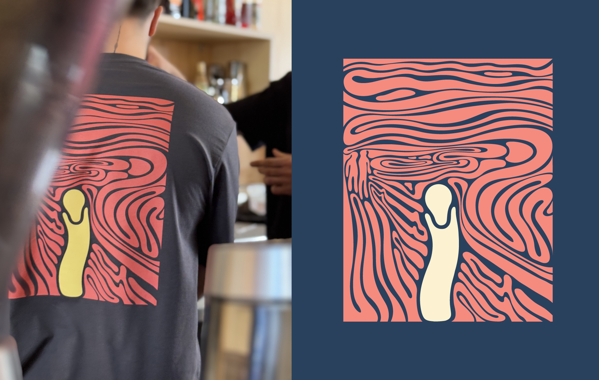
Inspired by Munch’s iconic painting “The Scream”,
the brand wasn’t just looking for a new look. It was in search of a whole new identity.
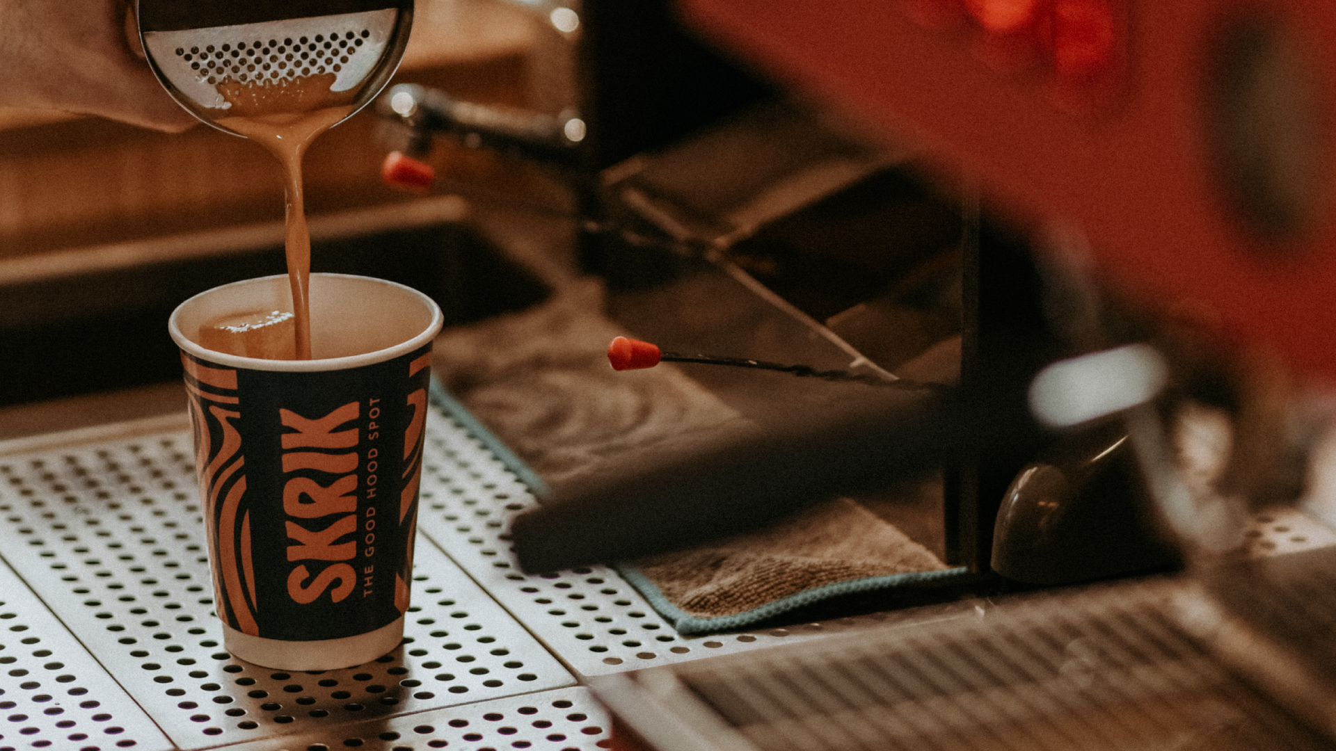
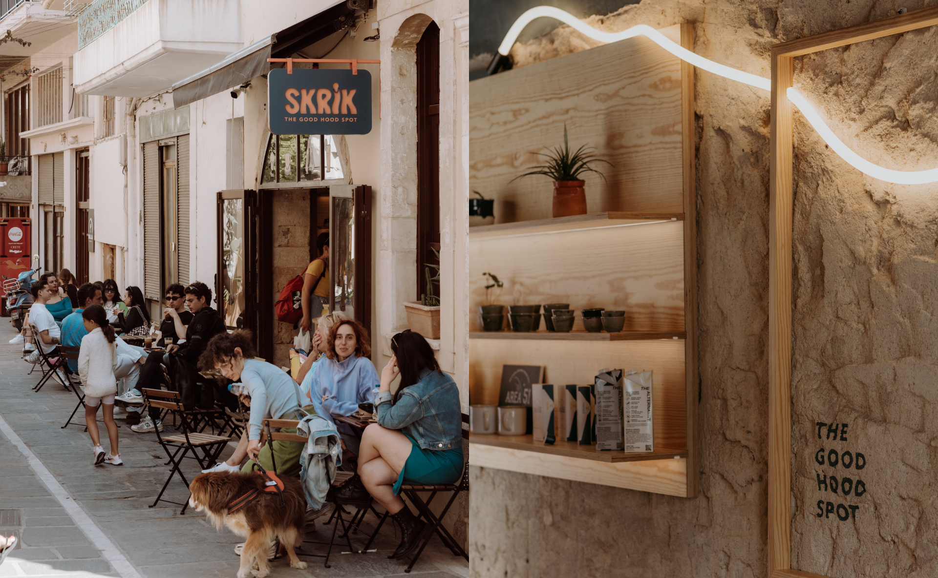
Skrik is not just a café. It’s a platform of expression for Rethymno’s youth. A meeting point for creatives, students, and anyone who moves with the pulse of the city.
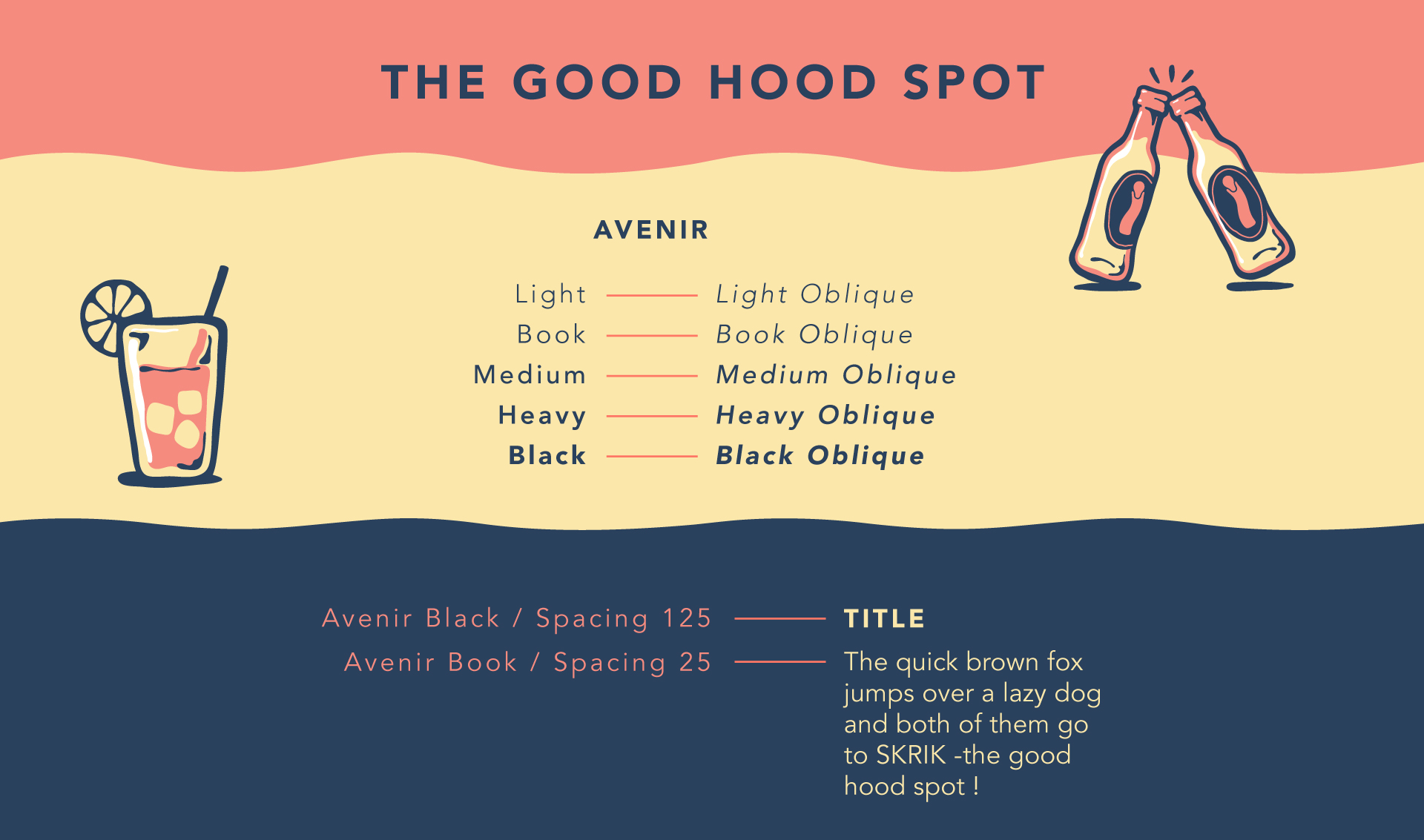
The rebranding we designed aimed to capture that energy and translate it into a visual language with real character. Direct, vibrant, and unapologetically raw. We built the brand from the ground up.
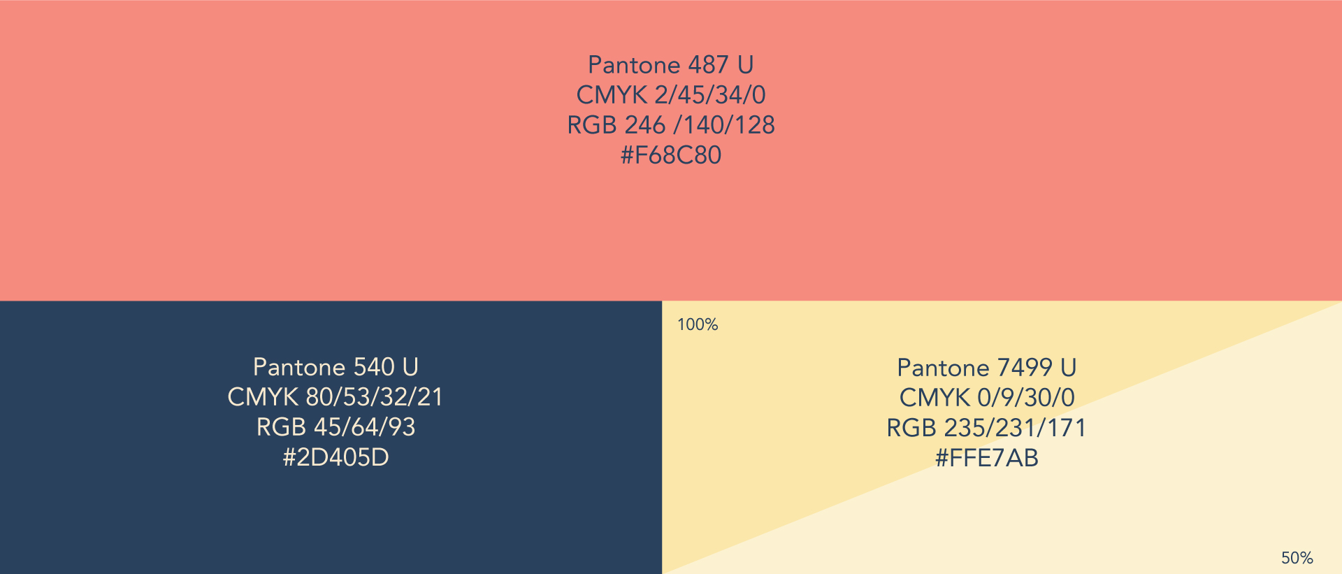
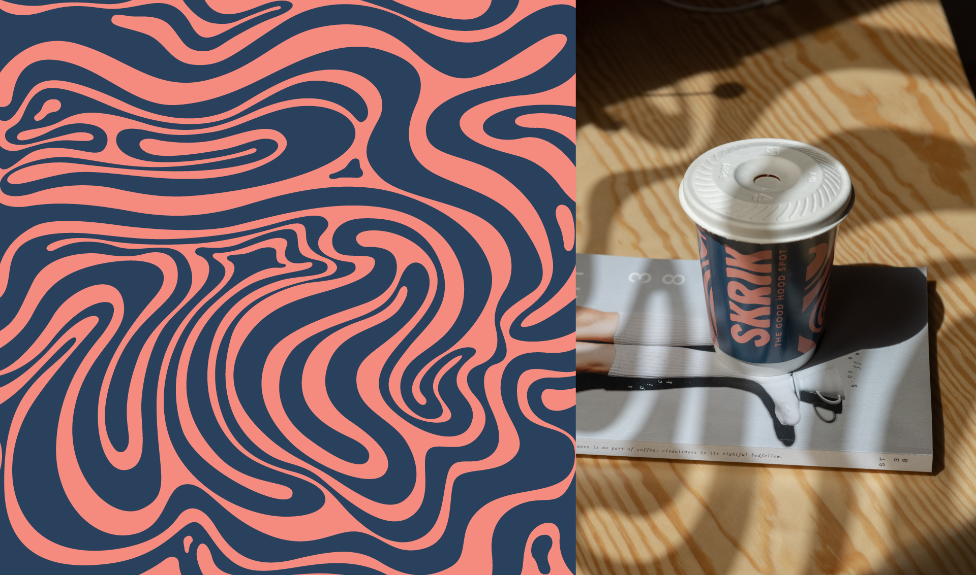
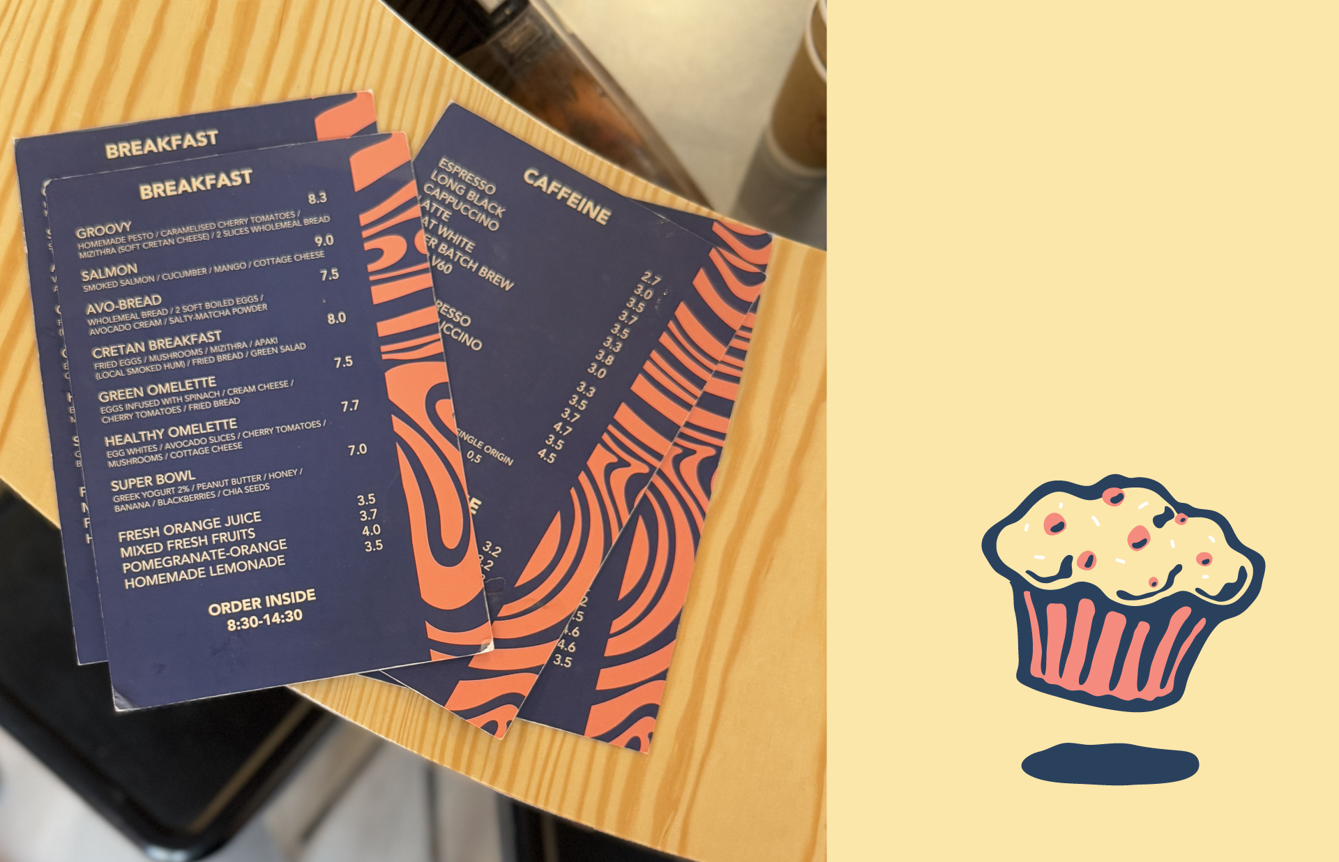
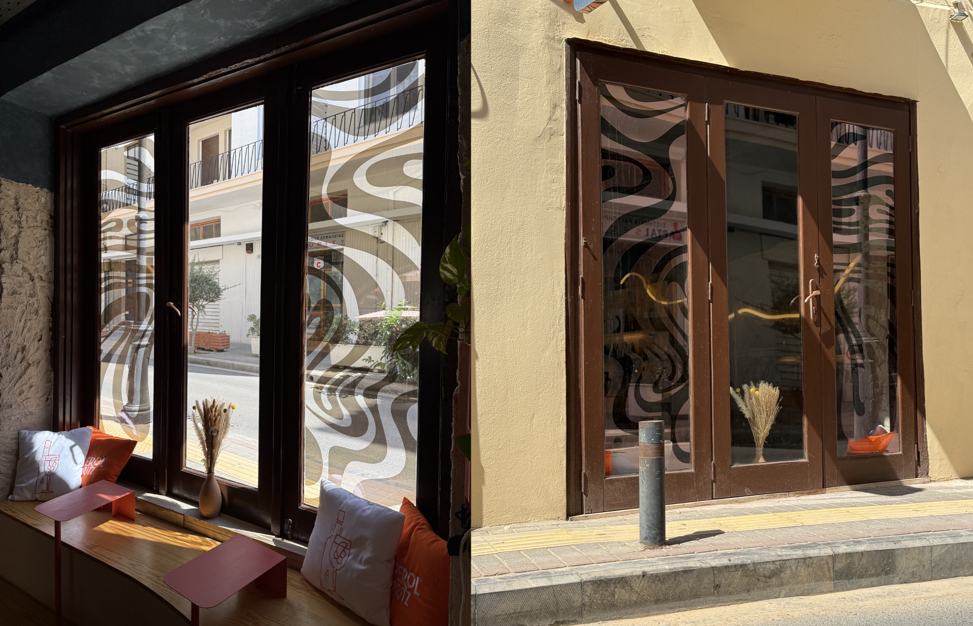
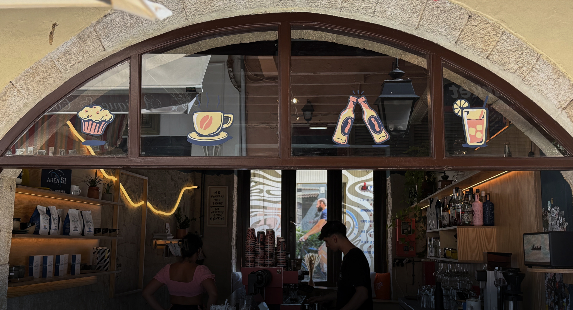
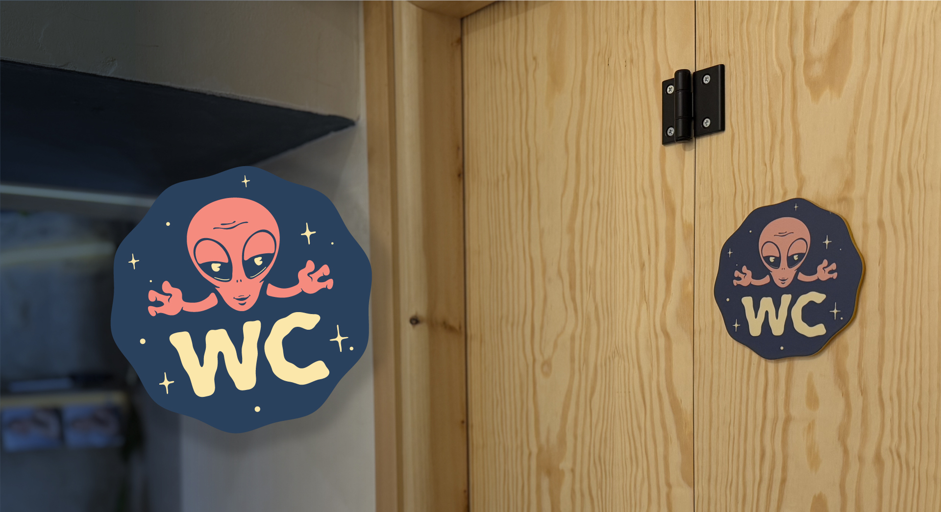
A new logo with a bold, clean presence. Color palette, tagline, supporting typography and icons. A custom pattern that lives on the shopfront and menus. The mascot character took center stage in the brand’s voice. It appears on promo stickers and acts as Skrik’s alter ego, a figure that speaks directly to its people.
We created merch like t-shirts and tote bags so the brand could walk the streets. Two handcrafted signage pieces were made exclusively for the space, tying into the materiality of the shop.
The strongest part was the collaboration. We worked seamlessly with the Skrik team, who knew what they wanted without limiting the creative process. Together with the architect behind the renovation, we shaped an identity that lives through the space, the sound, the rhythm, and the people of Skrik.
This wasn’t just a rebranding. It was a full experience design, from the logo to the last sticker on the glass.